Looking back at your preliminary task, what do you
feel you have learnt in the progression from it to the full product?


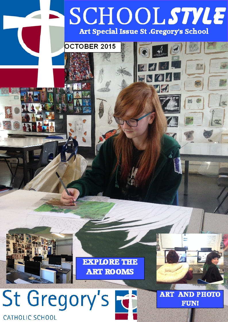
When I look back at my preliminary task, I feel that I have learnt a lot about technologies and magazines over a short period of time. The first magazine cover I created was a school magazine which is extremely different to my music magazine cover as 'Disgrace' is supposed to be dramatic. Since creating the school magazine, I have learnt about the conventions of a magazine and the importance of certain features to draw the audience in. The features included in my music magazine cover are essential as they agree with my target audience expectations and feedback as they felt that certain features need to stand out more than others. The photo shoots in my music magazine are well thought through and planned as I described what I intended to capture before the photo shoots in comparison to the school cover image where I only planned the location and the model for the shoot. The colour and the basic layout in the school magazine are reasonably successful as they are included in appropriate places and the colours are suitable to the magazine context. The bright colours and the bold features included in my music magazine help draw a young target audience in and the cover lines and the professional secondary images make the reader want to buy the magazine (this is because I studied my target audience and what they enjoy in a magazine). During the course, I learnt that applying puffs, pugs and an anchorage are very useful as they make important elements and features stand out. I experimented with the puffs on my music magazine as I thought they would make the cover seem quirky and to show a similarity in other rock magazines. I made the puffs and the anchorage a dark purple colour for my first draft which I was proud of but it did not look professional and therefore I had to get rid of the purple and a yellow suited it more. If it wasn't for the feedback of my teacher, the purple features would be remaining as I thought the irony of purple being a royal colour along side 'The New Queen' was clever but unfortunately it did not stand out.
When I started this course, I had not used Serif Page Plus and blogger so it was strange when planning the cover and not being able to make my cover a reality and to also document the process of this project. I have learnt to spend more time and attention on my different creative pieces and the details involved in my music magazine. I have had to create numerous drafts and improve features and where I place them so that my target audience is pleased with the outcome. These two magazine covers are very important to me as they show the increasing level of my knowledge through this project.